Brand identity begins with your first impressions; often judging a book by its cover, or in this case, by its logo. Getting to the meat of what a brand is about is a journey of getting to know who it is for, what the company is about, and what is important to impart in the first seconds that someone interacts with your brand. Below are a few logos that can be found in the wild as well as concepts that could be adopted and then released into the wild.

Fish Wisp – Concept Logo
Available for Adoption
Brief: Create a mark that would appeal to young families and would translate as an identity piece for a children's clothing boutique.
The name "Fish Wisp" was initially born by combining two words that were prompts for the Inktober Challenge in 2020. I knew that I wanted to create a mark for a children's boutique and then adding the word prompts offered a challenge and was a lot of fun. With these parameters in place, I fought a little bit with how to bring it together. Pulling inspiration from children's book illustrations from the 1960s, I knew I wanted something that carried that same illustrative feeling but also felt modern and relevant. Starting with a word list that then led to some rough sketches, the AHA moment occurred when the fish became whiskery hair sections. And thus, "Fish Wisp Children's Boutique" emerged.
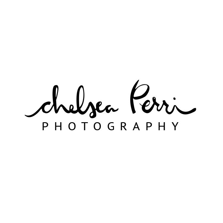
Chelsea Perri Photography
Chelsea Perri is a talented photographer located in Portland, OR specializing in Wedding, Family, Maternity, and Newborn Photography.
Brief: Chelsea wanted to use her signature as her logo. The signature is very personal as are the moments captured during a photoshoot.
Chelsea wrote her name several different ways. Using those as inspiration and the foundation for the mark, it was important to then make sure that line work was consistent, maintained a hand-written quality, and that the mark was clearly legible. Most importantly, Chelsea was thrilled with the final result.
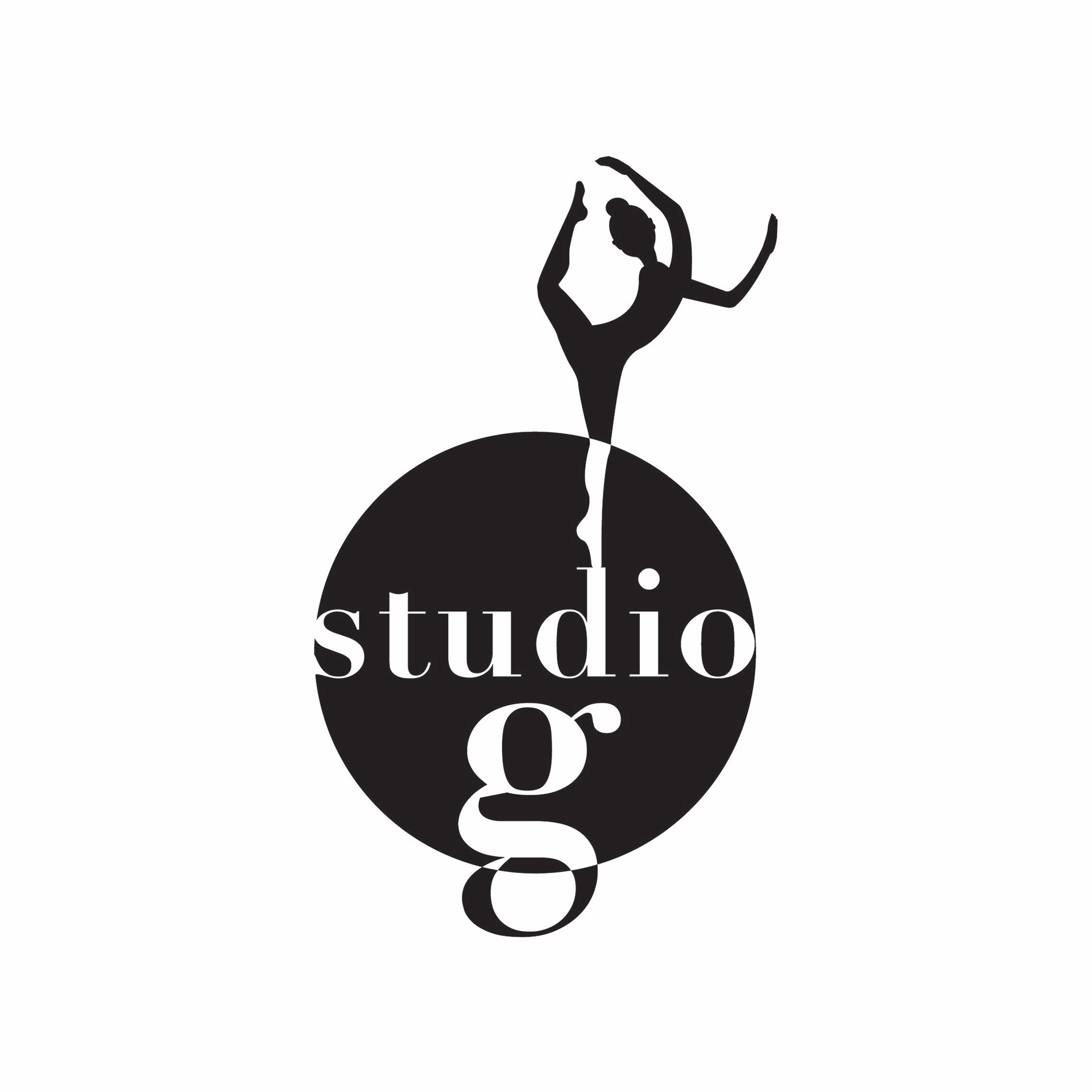
STUDIO G
Studio G was a yoga and dance studio located in the Montlake District in Seattle, WA prior to the pandemic.
BRIEF: Gloria, the instructor, wanted a logo that showcased a dancer but could also be interchangeable with a yoga pose. Overall, this was a dream client because she handed over complete creative control.
While having complete control over a mark is every designers dream, sometimes having total creative freedom can be a challenge. To focus my energy on a direct solution, I focused on what the dancers are working towards: confidence, perseverance, and determination. From there, I catalogued multiple reference images that demonstrated poses that showed strength and resembled something from both dance and yoga. "Studio G" being placed in the circle was intentional as it references a dancer in the spotlight and the use of the lowercase "g" mirrors the dancerly feel of the figure. The typeface is classical but, used in this way, also has a modern aesthetic.
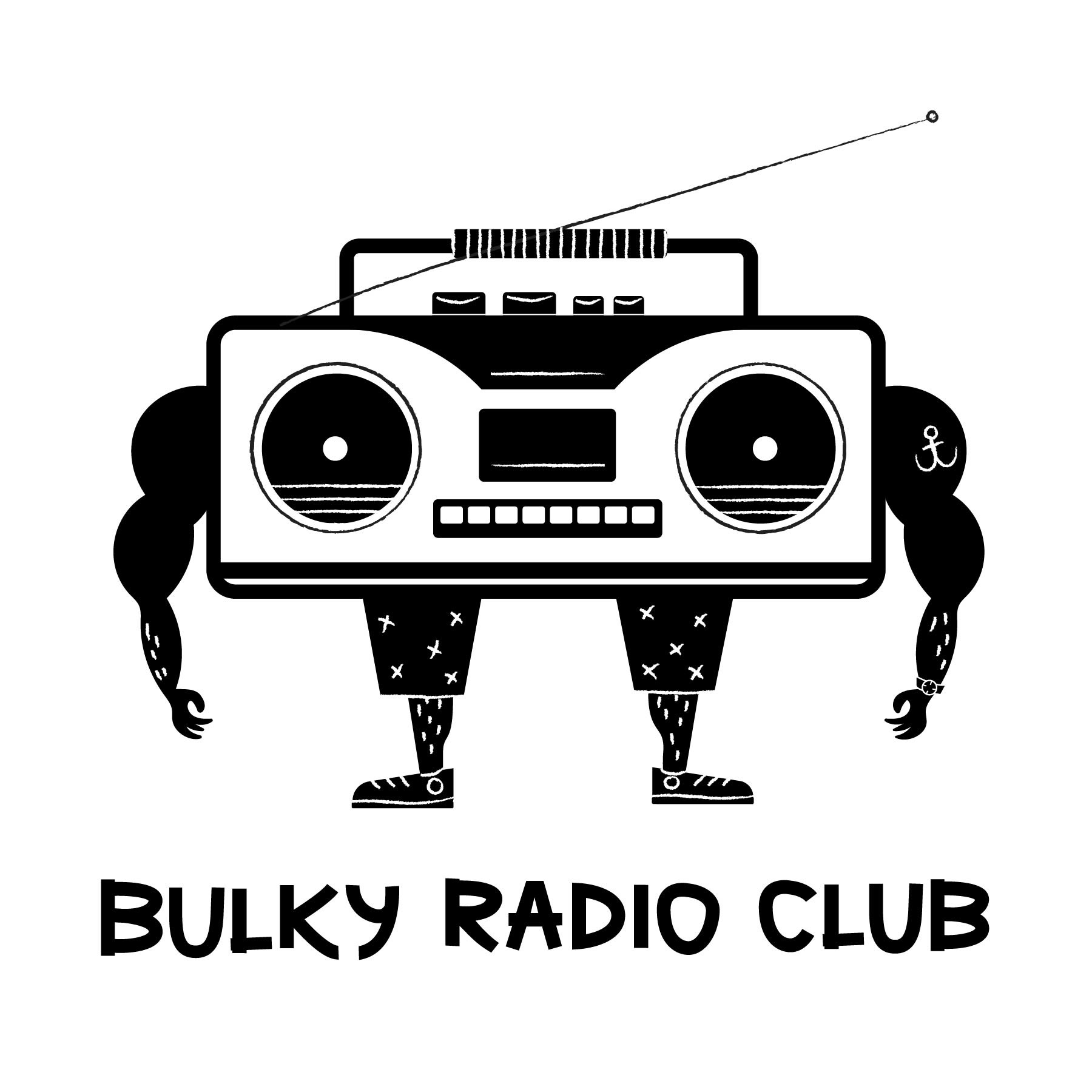
Bulky Radio Club – Concept Logo
Available for Adoption
Brief: Miami has a very diverse beach scene where muscle clad beach goers arrive hoping to out grease and out 80s other scantily clad individuals. The Bulky Radio Club is a gym along the boardwalk where patrons can go from pumping iron to donning their tank, boom box, and rollerblade their way into the sunset. The mark should combine the essence of the Miami beach scene and overall fitness. Additionally, the mark should stay away from the traditionally stuffy mark and should be fun and maybe even humorous.
The name "Bulky Radio Club" was initially born by combining two words that were prompts for the Inktober Challenge in 2020: bulky and radio. The added challenge was to focus on health and fitness without going the traditional route. Combining custom type and the "tough guy with a big heart" gym rat vibe and let me present the bulked out radio head.
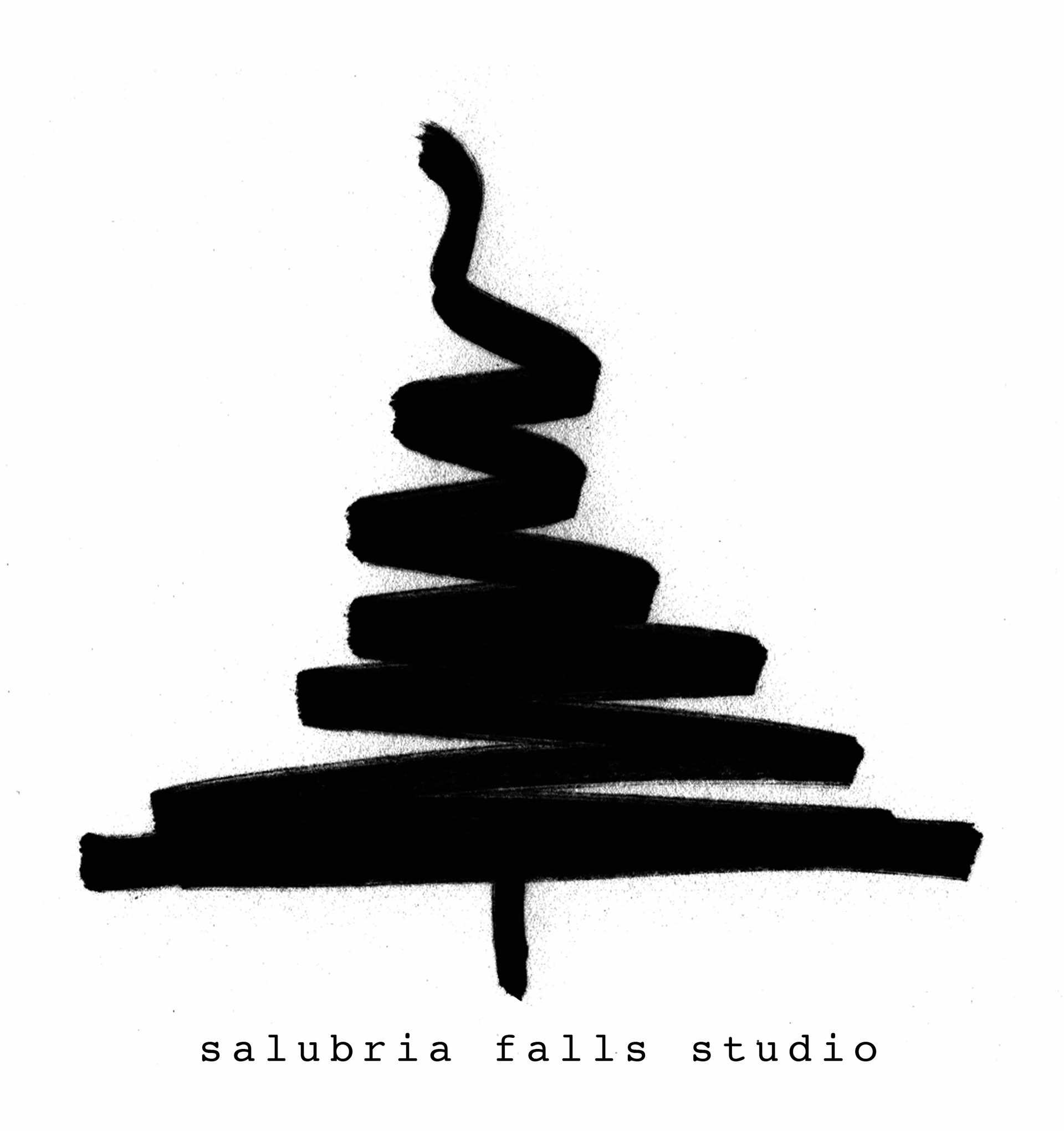
Salubria Falls Studio
Salubria Falls Studio is a woodworking studio based on Whidbey Island, WA where youth and adults alike can come and learn the ins and outs of wood turning and the master woodworker sells his one of a kind, hand crafted items.
BRIEF: Create a mark that 1. has the appearance of burnt wood 2. uses the signature tree scribble typically drawn onto the bottom of the turned wood items 3. simple 4. nostalgic
After discussing and defining what nostalgia looks like and digging deeper into my client's brand, he told me the story of where Salubria Falls originated. When he was young, his father told him stories of a fictional place somewhere in the PNW called Salubria Falls. In the telling, it had a very Mark Twain feel about it and we landed on the American Typewriter Typeface to tie in the sense of nostalgia. He uses the scribbled tree because it is a fast signature that he can easily place on his completed works. Combining these elements, I was able to create a simple, elegant mark.
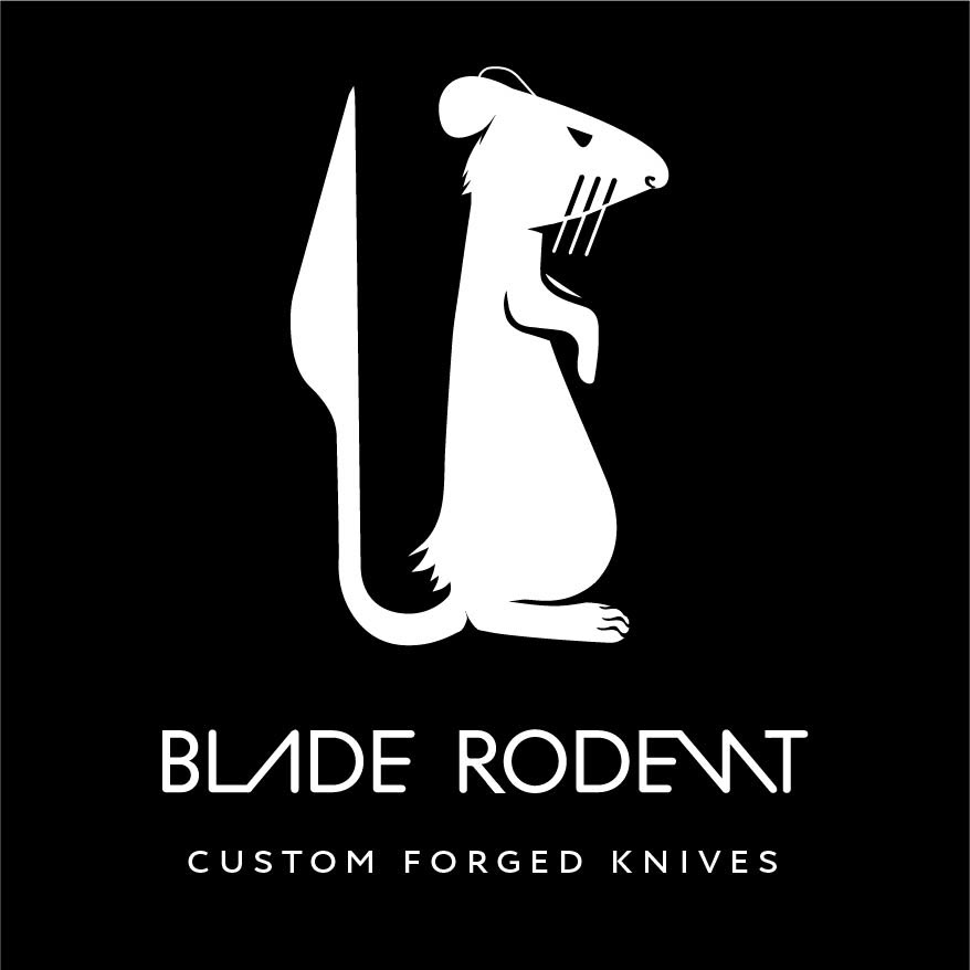
Blade Rodent – Concept Logo
Available for Adoption
It takes years of training and working as an apprentice under the watchful eye of a master bladesmith before you can emerge and open your own forge. When that happens, it is only natural to want to take ownership of all aspects of your brand and that is exactly where Blade Rodent begins...at the beginning.
BRIEF: Blade Rodent needed a word mark that could stand alone but could also showcase the master bladesmith's beloved pet rat. The mark should convey strength, resourcefulness, and ingenuity.
The name "Blade Rodent" was initially born by combining two words that were prompts for the Inktober Challenge in 2020: blade and rodent. The word mark needed to be unique and memorable. By leaving the counter out of the "A" and reversing the "N", you create visual symmetry that is very unique to Blade Rodent. These letter forms also tip their hat to the tip of the blade and push the viewer's eye up to the rat. The rat's tail becomes a blade and the rat's form is alert but relaxed, similar to the personality of the master bladesmith. Customizing the font to create the "LA" and "EN" ligatures creates interest as well as the arms of the "E" decreasing in size as they go down. The top left corner of the letterforms are a hard 90 degree corner whereas the other corners are rounded, referencing the blade and handle of the knife.